Your viz needs an intervention
SheetShow diagnoses what's broken in your dashboards, slides, and reports — then tells you exactly how to fix it.
Trained on Tufte · Knaflic · Cairo · Kirk · Minto
← Drag to compare →
You're brilliant with data
You can write SQL in your sleep. Your pipelines are works of art. Your causal inference methodology would make a statistician weep with joy.
But then someone asks you to present it.
...and then this happens
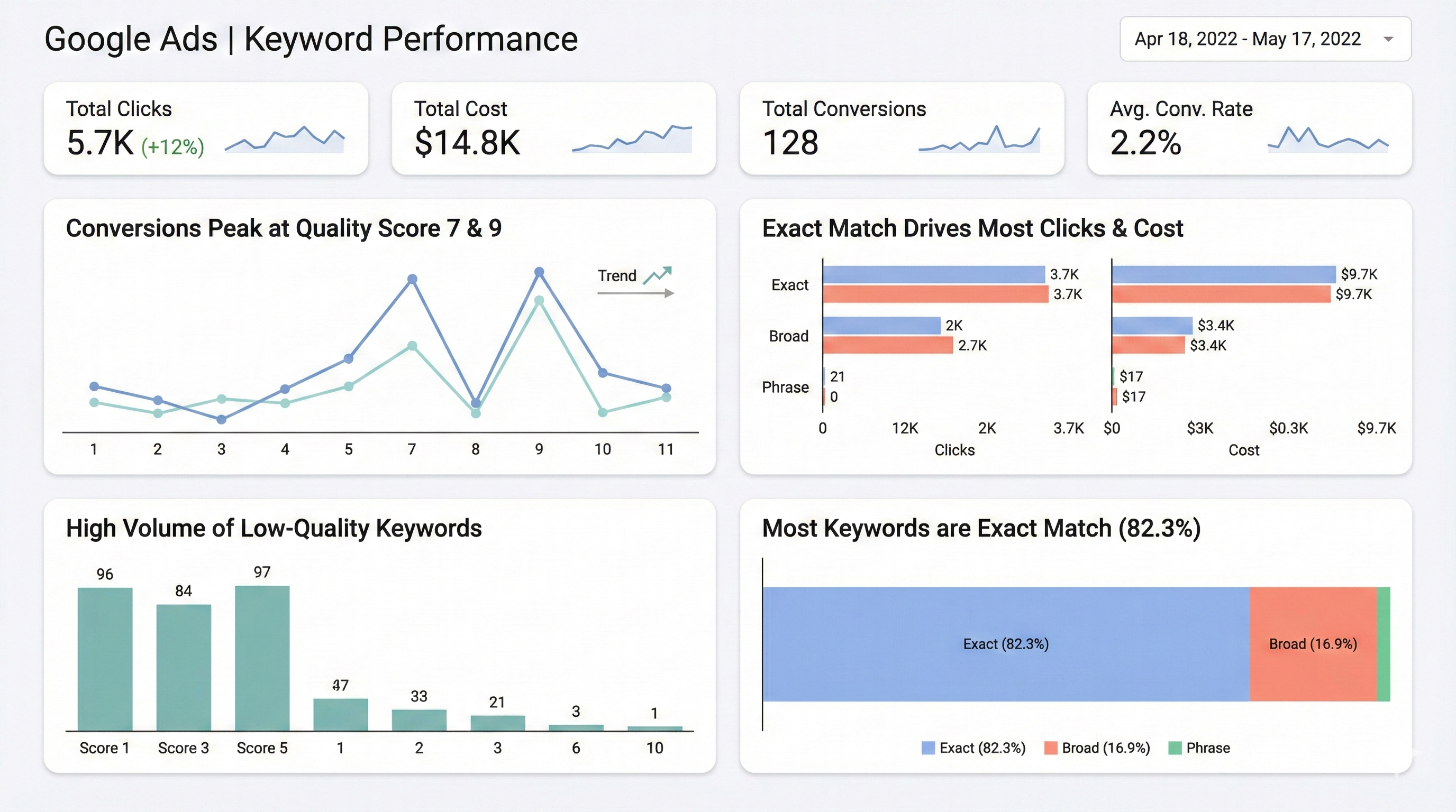
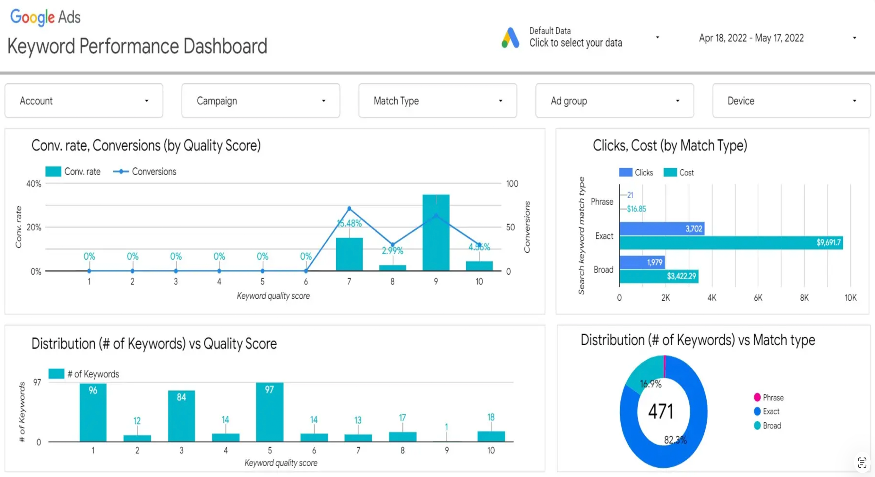
Rainbow pie charts. Walls of numbers. Slides that say "Q3 Revenue Overview" and nothing else. Dashboards with 47 KPIs where everything is equally important — which means nothing is.
We've all been there.
It's not your fault
The skills that make you great at interrogating data don't automatically make you great at presenting it. And that's fine. You shouldn't have to be both a data engineer and a designer.
So we built you an oracle.
How SheetShow Works
Three steps. No design degree required.
Drop your viz
Dashboard, slide, report, email — SheetShow auto-detects what you uploaded and applies the right evaluation framework.
Get diagnosed
Not just "your colors are bad." SheetShow evaluates your communication structure — argument, hierarchy, decision-enablement, and narrative flow. Scored 1-5.
Know exactly what to fix
Three priority-ordered fixes with specific, actionable instructions. No vague advice. No "consider your audience." Real prescriptions.
Not just another AI critique
Paste your dashboard into ChatGPT. You'll get “consider using a bar chart instead of a pie chart.” Groundbreaking.
Structure, not just style
Most tools check if your chart looks pretty. SheetShow checks if your communication actually works — does it make an argument? Does the hierarchy match importance? Can someone make a decision from this?
Auto-detects what you uploaded
Dashboard? Slide? Report? Email? SheetShow knows the difference and evaluates accordingly. A dashboard is a monitoring instrument. A slide is a persuasion instrument. Different purpose, different criteria.
Trained on the masters
Not generic AI opinions. SheetShow's evaluation engine is built on frameworks from Tufte, Knaflic, Cairo, Kirk, Minto, Kahneman, and Duarte. The same principles taught at the best data viz courses — applied automatically to your work.
Headline Analyzer for slides
Upload a presentation slide and get a dedicated headline diagnosis. Is your headline describing or concluding? SheetShow scores it and rewrites it as an insight-driven headline that actually tells the audience what to think.
People seem to like us
Winner — Golden Punchcard, Superweek 2026
Audience-voted most innovative analytics tool
“Finally, someone built this.”
— Early Tester
“I uploaded my board deck and the headline analysis alone was worth it.”
— Early Tester
“It told me my dashboard had no argument. It was right.”
— Early Tester
Works on everything data people create
Dashboards
Power BI, Tableau, Looker, Excel — upload a screenshot and get a monitoring fitness diagnosis. Is your dashboard helping people notice the right things?
Presentation Slides
The slide that's supposed to convince the CMO. Is your headline a label or an insight? Does the visual prove your point? Includes headline rewrite suggestions.
Reports & Documents
Monthly reports, analysis summaries, strategy documents with charts. Is your conclusion buried on page 12? Is the evidence sufficient?
Data Emails
That email with a chart you're about to send to leadership. Can they act on it in 30 seconds? Is the ask clear?
Ready to find out if your viz is a SheetShow?
It's free. It's fast. It's brutally honest.
Currently invitation-only · Request Access ·